The copper-to-gold ratio is the price of copper divided by the price of gold, most often quoted as the price of a metric tonne of copper against the price of a troy ounce of gold. Higher readings tend to accompany stronger expectations for global industrial growth, while lower readings tend to accompany heavier demand for defensive assets. It is a contextual market signal, not a standalone buy or sell trigger.
That definition matters more than it looks. Almost every mistake people make with this ratio comes from treating it as a magic threshold rather than as a temperature gauge that needs its own history attached to it.
Everything below is educational, not investment advice. Metal prices, rates and economic data change daily, and rules and reporting conventions differ by country and exchange.
Table of Contents
- What Is the Copper to Gold Ratio Signal?
- How Is the Copper to Gold Ratio Calculated?
- Copper/Gold and Gold/Copper Are Inverse Signals
- How Do You Interpret the Copper to Gold Ratio Signal?
- Why Do Traders Use Copper Instead of Gold for Growth Signals?
- What Does a High Copper to Gold Ratio Mean?
- What Does a Low Copper to Gold Ratio Mean?
- The Gundlach Connection and the 10-Year Yield Thesis
- Why the Dollar Neutralisation Effect Cuts Both Ways
- Where Does the Ratio Sit Now?
- Which Market Signals Confirm or Contradict the Ratio?
- Leading checks
- Coincident checks
- Risk-management checks
- How Do You Track the Ratio Yourself?
- How Can Investors Use the Ratio Without False Precision?
- What Are the Main Limitations of the Copper to Gold Ratio?
- Frequently Asked Questions
- Is a high copper to gold ratio bullish?
- Can the copper to gold ratio predict a recession?
- Why does the copper to gold ratio matter to investors?
- What other metals and indicators should I monitor with the ratio?
- What is the current copper to gold ratio?
- Will gold go up during a recession?
- Conclusion
What Is the Copper to Gold Ratio Signal?
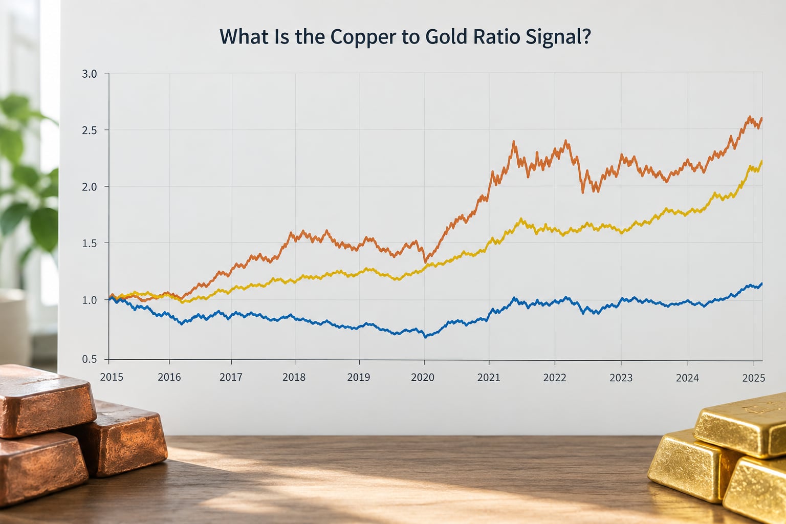
Copper is priced on industrial demand. Construction, manufacturing, grid buildout and vehicle production all consume it, so its price tends to rise when the outlook for physical activity improves. Gold is priced on uncertainty. It pays no coupon, it carries no counterparty risk in the way a bond does, and demand for it tends to pick up when investors want something that is not a promise from a government or a company.
Put those two behaviours on one chart and you get a rough gauge of how the market is pricing the balance between growth and fear. That balance is what people mean when they call it the copper-to-gold ratio signal, or sometimes the Gundlach indicator after Jeffrey Gundlach of DoubleLine popularised it.
Two honest caveats belong in the definition rather than buried at the end. First, it is a relative price, so it can move because the numerator fell, the denominator rose, or both. Second, both legs can move together, which is exactly when the signal gives you nothing.
How Is the Copper to Gold Ratio Calculated?
The formula is simple. The difficulty is entirely in unit consistency and in what you compare the result against.
Ratio = price of copper per unit ÷ price of gold per troy ounce
The catch is that copper is quoted per pound on COMEX and per metric tonne on the LME, while gold is quoted per troy ounce almost everywhere. Mix those conventions carelessly and your number is meaningless. Pick one copper convention, one gold convention, and one time window, and never compare a reading built from pounds against a reading built from tonnes.
| Step | Input | Illustrative value |
|---|---|---|
| 1 | Copper, LME cash, per metric tonne | USD 9,800 |
| 2 | Gold, spot, per troy ounce | USD 3,400 |
| 3 | Formula | 9,800 ÷ 3,400 |
| 4 | Result in tonnes per troy ounce | about 2.88 |
| 5 | Same reading expressed per pound | about 0.0013 |
Rows four and five are the same economics expressed in two unit systems, which is why a headline reading of 0.0013 and a chart reading of 2.88 can both be correct. It also explains why the raw number feels arbitrary. A ratio of 2.88 means nothing to anyone until you know where the long-run range sits and which of those two scales you are looking at.
Use the same price window on both legs. Comparing a spot copper price against a delayed gold quote produces a number that drifts for reasons that have nothing to do with either metal.
Copper/Gold and Gold/Copper Are Inverse Signals
The gold-to-copper ratio is the exact arithmetic inverse of the copper-to-gold ratio. One falls as the other rises, always. Commentary online mixes the two constantly, which is how readers end up convinced that a low ratio means copper is weak when it actually means gold has bid hard.
Before reading any chart, check which metal is in the numerator. Most free charting tools labelled copper/gold have copper on top, so a falling line means copper has underperformed gold, not that copper has collapsed.
How Do You Interpret the Copper to Gold Ratio Signal?
Direction first, level second. A ratio that has risen sharply from its own six-month base tells you something different from a ratio sitting at a high absolute level, and the two often disagree.
Then look at percentile against the history that matches your purpose. A three-year percentile says something about the current cycle. A twenty-year percentile says something about structural copper supply and central bank gold demand, which have both changed a lot. Pick the window that matches the claim you want to make.
Adjustment comes next. Because both metals are priced in dollars, a ratio calculated in nominal terms drifts with the Dollar Index. If you want the cleanest possible growth read, deflate both legs by a broad consumer price index or by the Dollar Index and calculate the ratio again. The unadjusted series is what most charts show and it is fine for tracking momentum, just not for making long-run level claims.
There is no universal number to watch for. Anyone who tells you a ratio above or below some fixed level is a buy or sell signal has skipped the part of the analysis that actually does the work.
Why Do Traders Use Copper Instead of Gold for Growth Signals?
Gold alone is a poor growth gauge. It responds to real yields, to currency debasement expectations, to geopolitical shocks, to central bank reserve policy and to plain fashion. Copper responds mostly to how much the world is building. The ratio isolates the first question by stripping out the components that move gold for its own reasons.
Copper’s demand profile is unusually broad. Air conditioning and grid wiring, electric vehicle motors and charging networks, data centre power distribution and residential rewiring all pull on it, alongside the traditional construction and capital expenditure cycle. That breadth is why analysts treat copper as a read on the industrial economy rather than on one sector.
China sits on a large share of that demand, through grid spending, infrastructure and the property cycle. When Chinese property policy shifts, the copper leg moves first and the ratio moves with it, sometimes well before Western purchasing managers’ surveys register any change.
The relationship does break, and it breaks in three situations worth naming: a mine disruption or a smelter outage, which lifts copper for supply reasons; a global recession, where safe-haven demand for gold becomes powerful enough to swamp cyclical weakness; and a regime change in monetary policy, where the historic relationship between gold and yields stops behaving as it did.
What Does a High Copper to Gold Ratio Mean?
A high or rising ratio usually means the market is paying more for industrial metal and less for insurance. Read that alongside the alternatives before you commit to it, because several very different things push the number up.
| What moved the ratio up | What it actually tells you | How to tell the difference |
|---|---|---|
| Broader manufacturing demand | Real growth optimism, early-cycle conditions | Global manufacturing surveys and industrial production both improving |
| Copper supply disruption | Tight physical market, not stronger demand | Exchange inventories falling while treatment charges drop |
| Gold sold off | Numerator stable, denominator weak | Real yields rising sharply, gold flat to lower |
| Dollar falling | Mechanical effect on both legs | Ratio rises in dollar terms but not in a dollar-neutralised series |
| Risk appetite returning | Positioning shift, often short-lived | Equity breadth and credit spreads improve together |
The pattern matters more than the level. A high ratio that keeps rising while inventories rebuild is telling you something different from a high ratio produced by a single mine outage.
What Does a Low Copper to Gold Ratio Mean?
A low or falling ratio says the market is paying a premium for safety relative to industrial metal. In practice that has meant slower global growth expectations, tighter financial conditions and heavier safe-haven and central bank demand for gold.
The historical record gives the signal its reputation. The ratio reached multi-decade lows ahead of the 2008 financial crisis and again around the 2020 pandemic shutdown, both of which were followed by severe global contractions. Traders who watched it then had unusually useful advance warning, and that track record is the source of the recession-indicator label.
But the recent record is the awkward part. Reuters reported in November 2025 that analysts were describing the ratio as bent but not broken after it pushed to multi-decade lows without a recession arriving. Taosha Wang used that framing, and it is a fair summary of the state of the argument: the low is real, the confirmation never came.
There are non-recession explanations for that. Chinese construction demand has been structurally softer than it was in the 2010s, so the copper leg starts each cycle from a lower base. Central bank gold buying has added a buyer that does not care about growth at all. Energy transition spending has added copper demand that is real but slow and policy-driven, which softens the dips rather than reversing them.
The Gundlach Connection and the 10-Year Yield Thesis
The most quoted use of the ratio comes from Jeffrey Gundlach, who argued that the copper-to-gold ratio functions as a fair-value estimator for the 10-year Treasury yield. On that reading, a low ratio implies the 10-year should trade lower, and a rising ratio implies it should trade higher. The spread between the two is treated as a tradeable gap.
Treat it as a hypothesis with serious critics, which is how it should be presented. The CFA Institute examined the relationship and found it vulnerable to a macro paradigm shift: a period in which the dollar rallies and Treasuries rally together breaks the historical mapping between the ratio and yields. Tradeable does not mean reliable, and a decade of strong data does not survive every regime.
Why the Dollar Neutralisation Effect Cuts Both Ways
The CFA Institute’s numbers are worth repeating because almost nobody else publishes them. Copper’s correlation to the Dollar Index ran around minus 0.10, gold’s around minus 0.31, and the ratio’s around minus 0.01.
That near-zero correlation is the ratio’s best feature. Dividing two dollar-priced series cancels most of the shared dollar exposure, so the ratio gives you a cleaner growth-versus-fear read than either metal alone.
It is also the weakness. When the dollar is the thing actually driving both legs, the cancellation removes real information. A strong-dollar recession will look risk-off on the ratio, but a dollar move caused by relative policy expectations can suppress copper without anything changing in physical demand. Cleaner is not the same as complete.
Where Does the Ratio Sit Now?
As of October 2026 the ratio sits in the lower part of the range it has occupied since 2010, and the recovery from that low has been slow rather than decisive. That is the honest state of the evidence, and it is why the current reading supports caution rather than a recession call on its own.
I would not quote a precise number here without checking a live series on the day you read this. Ratios move, and a figure baked into an article goes stale quietly. What is durable is the method: take the reading, compare it with the past five and ten years, and note whether it is rising or falling.
One further wrinkle deserves a mention. Macro commentary sometimes points to a high rolling co-efficiency between gold and copper, which undercuts the idea that the two legs always move in opposite directions. When they rise together, the ratio goes sideways and tells you almost nothing about growth.
Which Market Signals Confirm or Contradict the Ratio?
The ratio is a starting point, not a conclusion. These are the checks worth running, grouped by when they turn.
Leading checks
- Global purchasing managers’ indices, especially the new orders sub-index rather than the headline.
- Chinese credit and infrastructure announcements, which hit the copper leg before they show up in Western data.
- LME and COMEX copper inventory levels and cancelled warrants.
- Forward curves: a steep contango signals plentiful supply, a sharp backwardation signals real tightness.
- Commodity breadth, the share of metals trading above their own 200-day averages.
Coincident checks
- Global industrial production, with a lag of a few weeks.
- Real interest rates. Rising real yields usually pressure the gold leg and lift the ratio without any growth improvement.
- The Dollar Index, so you know whether the move is mechanical.
- Corporate credit spreads, which widen early in a slowdown.
- Gold positioning data, particularly central bank purchase announcements.
Risk-management checks
- Equity market breadth and the ratio of defensive to cyclical sector performance.
- Copper miner equity performance relative to the metal itself, which tells you whether the market believes the supply story.
- Freight and energy costs per tonne shipped, a quiet early warning on demand quality.
How Do You Track the Ratio Yourself?
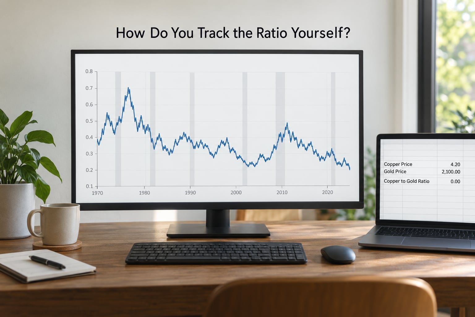
You need two price series and a spreadsheet, which is the whole point. This is not a signal that requires proprietary data.
For copper, use the LME official cash settlement for a metric tonne series or COMEX copper futures for a pound series, and pick one. For gold, use the LBMA daily price or COMEX gold futures, per troy ounce. Free charting tools such as TradingView and Stooq will plot both; LongtermTrends publishes a ready-made long-history chart if you would rather not build it.
The calculation takes three steps: divide the copper price by the gold price using the same units on both legs, record the result with today’s date, and repeat on a fixed schedule. Once you have a series, the useful part starts: percentile it against its own five-year and ten-year history, and overlay the 10-year Treasury yield if you want to test the Gundlach hypothesis yourself.
Check weekly rather than daily. Daily noise in either leg produces ratio swings that say nothing about growth, and a weekly series removes most of them.
How Can Investors Use the Ratio Without False Precision?
A workable process has five steps, and the last one is the one most people skip.
1. Fix the window. Weekly, monthly or quarterly. Write the date. A reading without a date is not an observation, it is a memory.
2. Place it in its own history. Percentile over three, five and ten years separately. Divergence between those three numbers usually tells you the level is structurally different from the past rather than cyclically extreme.
3. Identify the catalyst. What changed? A policy shift, a mine outage, a central bank announcement, a demand survey. A ratio move with no identifiable cause is noise.
4. Confirm with two independent indicators. One from the growth side such as purchasing managers’ indices or industrial production, and one from the financial side such as credit spreads or real yields. If both disagree with the ratio, the ratio is the one that is wrong.
5> Define what would invalidate the read. This is the step that turns a signal into a process. If you are acting on a low ratio, name the level or the date by which you would abandon the view.
| Reading | Typical interpretation | Suitable risk control |
|---|---|---|
| Rising from a low percentile | Growth expectations recovering, early-cycle tilt | Add cyclical exposure in stages, keep gold as ballast until two confirmations land |
| Flat in the middle of the range | No usable edge, mixed macro signals | Take no directional position, use the ratio only as a background input |
| Falling toward a low percentile | Caution on growth, defensive positioning | Reduce cyclical exposure, watch credit spreads and manufacturing data weekly, set a review date |
For sector rotation, the ratio is a starting tilt rather than an allocation. It says whether the environment favours cyclical or defensive exposure. It does not tell you which specific company or sector to own, and it has no view on valuation.
What Are the Main Limitations of the Copper to Gold Ratio?
The problems are worth stating plainly, because most of them do not show up in the popular descriptions of the indicator.
| Distortion | Cause | How to adjust |
|---|---|---|
| Unit confusion | Copper quoted per pound and per tonne, gold per troy ounce | Fix one unit convention per series and never mix sources |
| Structural supply shift | Energy transition, electrification and reshoring add copper demand and new mine supply on different timelines | Weight ten-year percentiles less than three-year percentiles |
| Volatile gold demand | Central bank purchases, geopolitical shocks and ETF flows move gold for reasons unrelated to US growth | Check gold positioning before attributing a ratio move to growth |
| Roll effects | Futures-based series shift as contracts roll, distorting short-horizon changes | Prefer spot or continuous-contract series with consistent roll rules |
| Regional mismatch | The ratio is global, most macro data most readers follow is US-focused | Add Chinese and euro area activity data before concluding |
| Both legs moving together | Global liquidity events lift gold and copper at once, flattening the ratio | Treat a flat ratio as no information rather than as balance |
The biggest of these is the sixth. A ratio that sits still tells you nothing, and plenty of extended periods have been exactly that. Used as a coincident context gauge with confirmation checks, it is useful. Used as a timed recession indicator with a fixed threshold, it has already failed once in plain view.
Non-macro uses exist too. Some traders on r/Bitcoin have argued for years that copper/gold bottoms line up with the start of Bitcoin bull markets, and the ratio does get watched as a mining supply proxy in the silver community. Those are traditions worth knowing about, not evidence worth trading on.
Frequently Asked Questions
Is a high copper to gold ratio bullish?
A high copper to gold ratio is generally read as a constructive signal, because it means the market is paying more for industrial metal and less for defensive assets. That reading only holds when demand is driving it. If copper rose because of a mine disruption, or the ratio rose because gold fell as real yields climbed, the bullish interpretation does not apply. Check inventories and real yields before acting on the level.
Can the copper to gold ratio predict a recession?
Not reliably on its own. The ratio reached multi-decade lows ahead of the 2008 crisis and the 2020 shutdown, which built its reputation. It also printed multi-decade lows in 2025 without a recession following, and Reuters reporting described analysts calling it bent but not broken. Treat a low reading as a reason to check growth data, not as a forecast.
Why does the copper to gold ratio matter to investors?
It condenses two opposing forces into one number. Copper reflects demand tied to manufacturing, construction and electrification, while gold reflects demand for safety and distrust of other assets. Dividing one by the other strips out much of the shared dollar exposure, giving a cleaner read on growth versus fear than either metal delivers alone. The CFA Institute put the ratio’s correlation to the Dollar Index near zero.
What other metals and indicators should I monitor with the ratio?
Useful checks include aluminium, silver, platinum and oil on the industrial side, plus exchange copper inventories and treatment charges. On the macro side, global manufacturing surveys, Chinese activity data, industrial production, credit spreads and real interest rates all confirm or contradict the ratio. Commodity breadth tells you whether the move is broad or confined to copper.
What is the current copper to gold ratio?
Check a live series rather than a figure written into an article, because the reading moves daily. As of October 2026 the ratio sits in the lower part of its post-2010 range, and the recovery from its 2025 low has been gradual. The LME copper cash price divided by the LBMA gold price, both on the same day, gives you the number in seconds.
Will gold go up during a recession?
Gold has historically risen during many recessions because it pays no coupon and carries no credit risk, and safe-haven demand tends to strengthen when risk assets fall. The exception matters: in the 2020 pandemic shock, initial liquidity demand forced gold lower before it rallied hard. Recession and gold are correlated most of the time, not reliably, and a forced-selling phase can come first.
Conclusion
The copper-to-gold ratio is worth watching because it compresses a genuine question into one number: is the market paying more for growth or for insurance? Its value is entirely in context, and its weakness is that it has already produced a dramatic false alarm.
So start with the two things you can do today. Pull the current reading from LME copper and LBMA gold on the same date, and compare it with the past five and ten years of your own history. Then confirm whatever it tells you with at least two independent indicators, one growth and one financial, and write down what would make you change your mind.