A yield curve is a graph showing the interest rates, or yields, on government bonds of the same credit quality across different maturity dates, running from a three-month bill to a thirty-year bond. So what is the yield curve in plain terms? It is a picture of what bond investors expect rates to do next, and the tilt of that picture gets read as an economic signal.
It is the single most quoted chart in rate news for a reason. Central bank watchers, mortgage lenders, bank analysts and ordinary savers all look at the same line, because the yield curve sets the benchmark that most other interest rates are priced against.
This guide walks through the mechanics first, then the three shapes you will see in the wild, then what the curve does and does not tell you. No finance degree required, and no jargon without a plain-language translation.
Table of Contents
- What Is the Yield Curve?
- How Do You Read a Yield Curve?
- What Is an Inverted Yield Curve?
- What Does the Yield Curve Tell Investors?
- Why Does the Yield Curve Shape Change?
- How Is the Yield Curve Different from Bond Prices?
- Frequently Asked Questions
- Can an inverted yield curve predict a recession?
- How long after an inversion does a recession start?
- Is an inverted yield curve good or bad for investors?
- Why do longer-term bonds usually have higher yields?
- Which part of the yield curve matters most, the 2-year, 10-year or 30-year?
- Where can I see the yield curve myself?
- Conclusion: Start With the Shape and the Spread
What Is the Yield Curve?
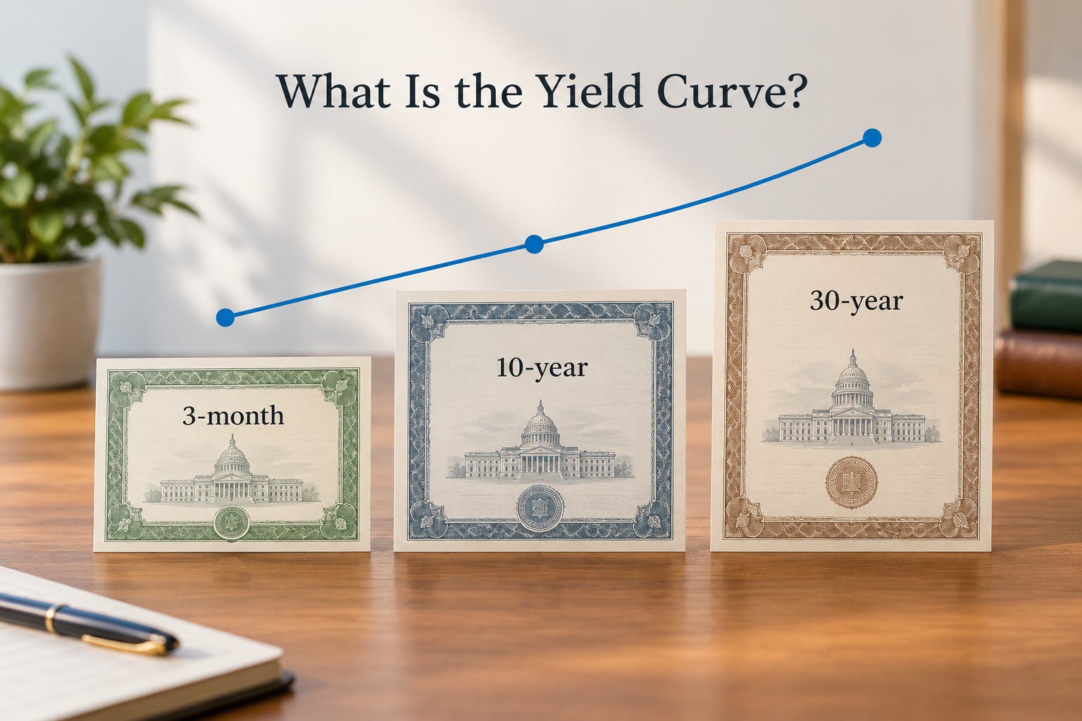
The yield curve is a line graph that plots the yield of bonds with equal credit quality but different maturity dates. Every point on the line is a different bond. Every bond on a government curve has the same credit standing, so the only thing that changes along the curve is how long you wait for your money.
That makes the curve a picture of the term structure of interest rates, which is just a formal way of saying what rates do at different maturities on the same day. A 3-month bill, a 2-year note, a 10-year note and a 30-year bond all sit on one chart, and the line connecting them is the yield curve.
It is worth separating the curve from any single bond. A 10-year Treasury yield of 4.20% is one number describing one security. The yield curve is the relationship between that number and the numbers beside it. People conflate the two constantly, which is why a chart of the curve never looks like a chart of a bond price.
On the US side, the number that gets quoted is usually the Treasury par yield curve, published each business day by the US Treasury. The par yield curve uses notional coupon rates, so every maturity in the chart assumes a bond priced at face value, which makes the maturities directly comparable.
How Do You Read a Yield Curve?
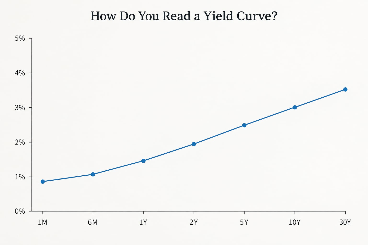
Read a yield curve from left to right, short maturities on the left and long maturities on the right, with yield in percent on the vertical axis. The vertical distance between any two points is the yield spread between those two maturities, quoted in basis points, and 100 basis points equals one percentage point.
So a 2-year yield of 4.20% and a 10-year yield of 4.55% gives a 2s10s spread of positive 35 basis points. That is a normally sloped curve. Reverse the numbers, with the 10-year below the 2-year, and you have an inversion.
Three shapes cover almost everything you will see. An upward-sloping or normal curve has long yields above short yields. A downward-sloping or inverted curve has long yields below short yields. A flat curve has them close together, usually within a few basis points, and it is the awkward one to interpret because it can mean the market expects growth or it can mean the market expects rates to stay put.
There is also a humped shape, where the middle of the curve is higher than both ends. It shows up when the market expects rates to rise in the near term and then settle, and it is less discussed than the other three but shows up plenty.
The other thing to know is that the curve is not frozen. When short yields fall faster than long yields, the curve steepens. When long yields fall faster than short yields, it flattens. Those two words, steepening and flattening, describe the movement rather than the shape, and they appear in almost every rates headline you will read.
What Is an Inverted Yield Curve?
An inverted yield curve is one where yields on longer-dated bonds sit below yields on shorter-dated bonds, so the line slopes downward from left to right. It is the shape that gets the most attention because it has preceded nearly every US recession of the past half century.
The reasoning is fairly intuitive. If a two-year government bond pays more than a thirty-year government bond, the market is saying it expects rates to be lower further out than they are now, and usually lower because policy is about to be eased. Central banks cut rates into slowdowns, so a market pricing that cut is usually pricing a slowdown.
Real example: in April 2022 the 2-year Treasury yielded about 2.44% while the 10-year yielded about 2.38%, a spread of roughly negative six basis points. That is a shallow inversion, and it is the kind that shows up in the data all the time. The US curve also inverted around 2006, 2019 and again across 2022 and 2023.
Two misconceptions are worth clearing up before anything else. An inversion predicts, it does not cause. And an inversion is not a starting signal, it is a warning that arrived earlier than most people were paying attention.
How much warning? The historical record is the strongest argument for watching it. Inversion has preceded each of the last ten US recessions, and the typical gap between the inversion and the start of the downturn is somewhere in the 12 to 24 month range. Plenty of recessions started inside a year of an inversion, and a few started well outside that window.
So the honest version is: an inverted curve lowers your expectations for the economy, it does not date the next downturn for you, and a shallow inversion has a habit of being noise rather than news. Depth and duration matter. A deep inversion that stays inverted tends to matter more than a brief one.
What Does the Yield Curve Tell Investors?
The curve tells investors what the bond market expects for future policy rates, growth and inflation, and it sets the discount rate for everything else. It is one input among many, not a trading instruction, and the same shape can be read several ways depending on what the Fed is doing at the time.
On inflation, a rising long end while short rates stay put usually reads as investors demanding more compensation for inflation further out. When the short end moves instead, the market is usually reacting to policy expectations. Which end moves tells you what kind of story is being told.
On bank lending, the curve matters because banks borrow short and lend long. A steep curve is friendly to net interest margins, since they can fund at two years and lend at twenty. A flat or inverted curve squeezes that spread, which is one reason the curve gets watched so closely by bank analysts in particular.
For housing, mortgages are priced off long yields, so a steep curve with a high long end means mortgage rates stay high even after the Fed starts cutting. Borrowers deciding between a 15-year and a 30-year fixed mortgage are really deciding how much rate risk they want to lock in. None of this is personal advice, and actual loan terms depend on your own situation and your lender.
For asset allocation, the practical uses are narrow. A steep curve gives short-term bonds a better starting yield, which supports a bond ladder. A flattening curve makes long-duration funds more attractive on entry. Investors often tilt toward defensive assets as a curve inverts, and the reasoning is not that bonds always rise in a recession, it is that the Fed cutting into weakness is usually followed by lower yields.
What the curve will not do is time your entry. Anyone who sold everything on the day a curve inverted and bought back on a fixed schedule would have missed a chunk of the recovery. The signal is a reason to slow down and check your assumptions, not a reason to move.
Why Does the Yield Curve Shape Change?
The shape changes because forces push short and long yields in different directions. Central bank policy moves the front end most directly, inflation expectations push the long end, and supply and demand for long-dated government debt can overwhelm both in either direction.
Fed decisions are the cleanest example. When the central bank raises its policy rate, three-month and two-year yields tend to rise quickly because those maturities track the expected path of policy almost one for one. Long yields often barely react, since a rate hike is a statement about the present, not the next decade. The curve flattens as a result.
Cutting works in reverse. Short yields fall first and the curve steepens, which is the pattern most people recognise as a central bank responding to weakness. A steepening curve after an inversion is often read as the market saying the low point in rates is approaching, not that it has passed.
Inflation expectations push the other end. If investors start demanding more return to hold 30-year paper, the long end rises and the curve steepens even if policy is unchanged. The 2022 move in long-end yields had plenty to do with this and very little to do with the Fed.
Then there is global demand for bonds. When investors anywhere in the world decide that US Treasuries are the safest liquid asset available, the long end can fall without any change in US growth expectations. That flight to quality behaviour is one reason inversions sometimes resolve without a recession.
Supply rounds it out. Heavy issuance of long-dated debt has to be absorbed by someone, and a large auction that disappoints pushes long yields up and steepens the curve. Liquidity matters in the same direction, since thin trading in some maturities widens the spread between them for reasons that have nothing to do with the economy.
How Is the Yield Curve Different from Bond Prices?
The yield curve shows yields, and bond prices move in the opposite direction to yields. A curve does not show prices at all, and the two are easy to mix up when you first see them because they often look like mirror images of each other.
When market yields fall, the price of an existing bond rises. That bond pays a fixed coupon, so a buyer paying less for the same stream of future payments gets a higher yield to maturity. When yields rise, the price of that same bond falls, and the holder takes a loss if they sell before maturity.
Duration is the number that quantifies this. A longer maturity bond has a larger duration, so a given change in yields produces a bigger price move. A 30-year bond is far more sensitive to a shift in the long end than a 2-year note, and that sensitivity is the main risk in a long bond fund.
For readers new to this, the practical way to hold it is: the curve is a map of rates, a bond fund is a bet on the map staying put, and moving the map is what makes bond prices jump around.
Frequently Asked Questions
Can an inverted yield curve predict a recession?
An inversion predicts, it does not cause. When long-term government bond yields fall below short-term yields, markets are pricing expected rate cuts, and central banks typically cut into a slowdown. Inversion preceded each of the last ten US recessions, but the lag before a downturn begins is usually somewhere in the 12 to 24 month range, so it is a warning about direction rather than a date.
How long after an inversion does a recession start?
Historically, the gap between a yield curve inversion and the start of a US recession has been roughly 12 to 24 months on average, though individual episodes vary widely. Some recessions began within a year of the inversion, others took considerably longer. Depth matters too: a deep inversion that holds for months carries more information than a shallow one that shows up for a week.
Is an inverted yield curve good or bad for investors?
Neither, on its own. Inversion has historically been a useful warning that growth slows, but acting on it by moving everything at once means guessing the timing, and the market often recovers before the data confirms anything. Most investors treat it as a prompt to review assumptions and risk rather than a signal to trade. A steep re-steepening curve later in the cycle tends to matter more for positioning.
Why do longer-term bonds usually have higher yields?
Two reasons. The expectations hypothesis says investors demand extra yield for locking money up longer because they expect future short-term rates to be higher, or because inflation may be. The liquidity premium hypothesis says long bonds are less liquid than short ones, so buyers want compensation for the extra difficulty of selling quickly. When those two forces work together, the curve slopes upward.
Which part of the yield curve matters most, the 2-year, 10-year or 30-year?
The 2-year and 10-year spread is the most watched, because it compares a maturity that tracks Fed policy expectations closely against the benchmark for mortgages and long-term borrowing. The 3-month to 10-year spread is a cleaner read on policy because the bill end has almost no term premium. Longer spreads such as 5s30s say more about long-run inflation and term premium than about the next Fed meeting.
Where can I see the yield curve myself?
The US Treasury publishes a daily par yield curve for every business day on its website, which is the primary source rather than a summary. FRED, the St. Louis Fed database, offers the individual series, including the T10Y2Y spread, and lets you chart them over decades. Reading the Treasury page each morning takes a minute and is a better habit than trusting a headline that paraphrases it.
Conclusion: Start With the Shape and the Spread
Start with two numbers: the short-term government bond yield and the long-term one. Compare them, look at the shape of the line between them, and then read the spread alongside economic data and Fed policy rather than on its own.
A yield curve is only useful once you know which shape you are looking at and how far it has moved from where it was a month ago. Check the primary source rather than a summary, keep the time horizon in mind, and treat any signal as one input among many.